453%
increase in psychological consultations in 2 years, linked to depression, panic attacks, sleep disorders, loneliness, and social strain.
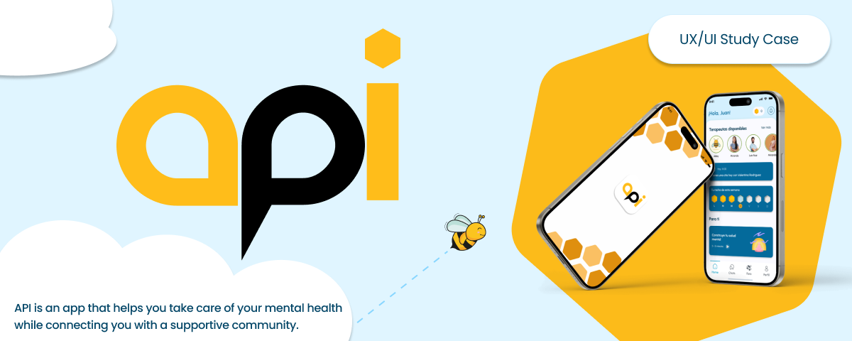
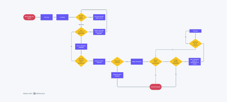
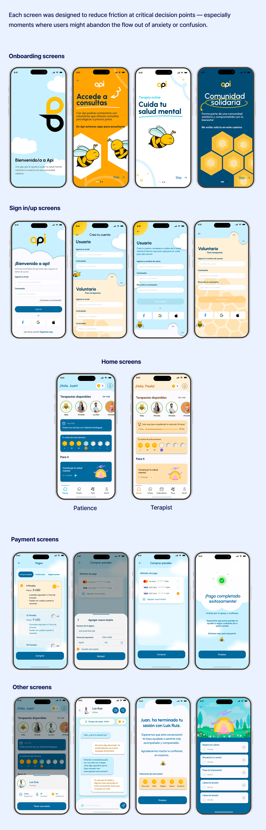
API is a mobile application designed to give Venezuelans, both in-country and diaspora, access to affordable psychological support. Users pay only for the time they use, with an AI chatbot available for free at any time and a "Panales" system to extend live sessions with volunteer therapists at accessible prices.
The project began as a broader concept: connecting Venezuelans needing health support with volunteers and donations. Through research and ideation, the team focused on mental health as the highest-urgency unmet need. I contributed to the full design process, from research synthesis and ideation to visual design, interaction flows, and the final prototype.
The starting point wasn't an app idea, it was a real crisis. Venezuela's socioeconomic collapse created a mental health emergency that existing platforms weren't designed to address. We began with secondary research to understand the scale of the problem before talking to a single user.
increase in psychological consultations in 2 years, linked to depression, panic attacks, sleep disorders, loneliness, and social strain.
of mental health professionals have migrated, severely limiting access to psychological treatment across the country.
Venezuelans aged 18 to 24 report feeling psychologically unwell, with deep concern about the national context.
of people identify economic problems as their main source of stress, directly linking financial pressure and mental health.
66.7%
Two-thirds of respondents said their biggest obstacle to caring for their mental health was lack of time and financial resources. Traditional consultations are simply out of reach for most of our target users.
92.6%
The overwhelming majority wanted an app that could provide support during stressful situations as they happen, not a scheduled appointment days later. Immediacy was non-negotiable.
88.9%
Nearly 9 in 10 users said they would feel motivated to use an app that gives them access to mental health professionals and tools to manage stress and anxiety, validating the core product direction.
77.7%
More than three quarters of respondents said they need psychological support at least once a month, establishing that the need is recurring, not a one-time crisis response.

Strengths:
Weaknesses:

Strengths:
Weaknesses:

Strengths:
Weaknesses:
Key insight from benchmark: No existing solution combined human professional support + AI assistance + cultural relevance + accessible pricing in a single platform designed specifically for the Venezuelan context.
In Venezuela, the socioeconomic crisis has intensified mental health problems, stress, depression, and anxiety, affecting a large portion of the population. Access to psychological services is severely limited due to the mass migration of professionals, scarce resources, and high costs. There is an urgent need for an accessible and effective solution that provides psychological support, especially for those who cannot pay for traditional consultations.
Luis arrived in Chile 3 months ago and is showing symptoms of depression. He has no one to talk to and can't afford psychological consultations. He wants to speak with a Venezuelan psychologist, someone who would understand his context and culture.
Paola just graduated and deeply understands Venezuela's reality. She wants to volunteer and gain meaningful experience. She loves that she can use the app from home, connecting with patients from across the diaspora while building her professional practice.
The initial idea was broader than the final product: a platform connecting Venezuelans needing health support, general and psychological, with volunteers willing to contribute their knowledge or resources, while also facilitating donations to social causes. Through ideation and prioritization, we refined this into a focused mental health product.
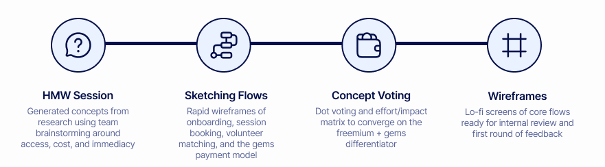
How might we deliver accessible and high-quality mental health support to people in Venezuela, overcoming economic and social barriers, while fostering a safe and trusted community for seeking help?
The breakthrough was the freemium + Panales model. Users access a free AI chatbot for immediate emotional support with no cost and no barrier. When they're ready to talk to a real volunteer therapist, they pay only for the minutes they use. To extend a session, they use "Panales", an in-app currency purchased at accessible prices.
This model directly addressed the two core barriers from our research: cost and commitment. Users don't need to sign up for an expensive subscription or commit to a hour-long session. They can try 10 minutes with a Venezuelan psychologist who understands their context and extend if they need to.
This model was a direct response to our research: 66.7% cited cost as their main barrier → freemium removes it. 92.6% needed on-demand support → 24/7 availability and AI chatbot address it.
The initial idea was broader than the final product: a platform connecting Venezuelans needing health support (general and psychological) with volunteers willing to contribute their knowledge or resources, while also facilitating donations to social causes. Through ideation and prioritization, we refined this into a focused mental health product.
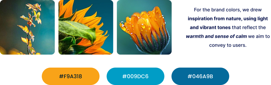
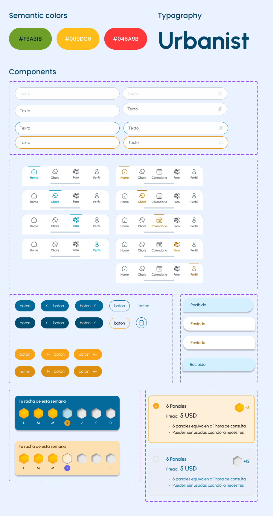
Api's tone should convey empathy, serenity, and trust. Since the application is related to health, it is essential that the tone remains calm, accessible, and respectful at all times, avoiding any language that could generate anxiety or pressure.
Api's voice will consistently communicate closeness and professionalism, maintaining a balance between being friendly and credible. The logo should inspire a sense of safety and trust without being overly formal.
Once we had a working prototype, we put it in front of real users. The goal wasn't to validate that it looked good, it was to find the flows that confused people before they could access support.
Participants matched our personas and were 18 to 35 who had never used a mental health app.
Users completed defined tasks: book a session, understand Panales system, and emergency support.
We tracked hesitation moments, incorrect taps, and verbal confusion without intervening.
Friction points were mapped by frequency and severity to prioritize fixes.
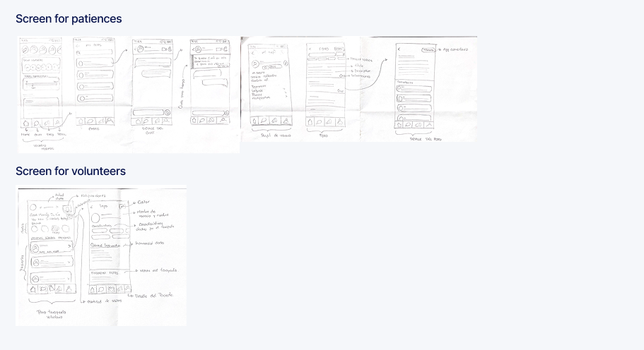
After completing the design, we tested the prototype to evaluate usability and the overall user experience by asking users to perform specific tasks and observing whether they could complete them without confusion.
the testing confirmed that the emotional tone of the design was landing correctly. Users described the experience as calming and friendly. Exactly what we designed for
Added a dedicated feature within the therapist section to enable psychologists to connect with other professionals. User research revealed that therapists also need support, whether to book consultations or seek guidance for their own mental health.
Introduced a session timer within the chat interface to help users stay aware of the remaining time. The timer dynamically changes its state as the session approaches its end, improving time management and reducing uncertainty.
Designed a structured "snapshot" view for therapists, presenting key patient information in a concise, scannable format. This allows quick access to essential data without the need to scroll extensively or navigate into the full profile.
Added an appointment reminder on the patient's home screen, allowing users to clearly see their upcoming session at a glance. This improves awareness and reduces the chance of missing scheduled support.
Mental health is not a neutral product category. Every copy choice, color decision, and interaction pattern carries emotional weight. Language that feels clinical can cause users to disengage; language that's too casual can feel dismissive of real pain.
Our approach: We defined a brand tone guide early in the process (calm, approachable, trustworthy) and applied it to every copy decision, from button labels to error messages. No clinical language, no pressure-inducing CTAs.
In-app currency is a well-known pattern in gaming, but it can feel exploitative or confusing in a healthcare context. We had to make the system transparent and trustworthy, not a mechanic that users would feel manipulated by.
Our approach: We named the currency "Panales" to connect it to the bee metaphor rather than gaming conventions, always showed real-money equivalencies (6 Panales = 1 hour, $5 USD), and avoided celebratory animations on purchase.
The pay-per-minute model, the product's core differentiator, came directly from what users told us in interviews. It wasn't a clever idea from a brainstorm; it was the logical answer to a clearly articulated pain point. No research, no insight. No insight, no product.
Designing for mental health made me acutely aware of how tone, color, and copy affect trust. Skills I thought were purely aesthetic, typography choice, component roundness, button copy, turned out to be deeply functional in this context.
Coming from systems engineering, I was able to identify early when certain design decisions would be technically costly or impossible. This made collaboration with the development side smoother and kept our designs grounded in what could actually be built.
Several designs I was proud of got cut after testing. Learning to separate personal investment from design quality, and to trust what users showed us over what we assumed, was the most valuable professional muscle I built on this project.
Web redesign
KVN Design is a website redesign that transforms an interior design studio's portfolio into a refined editorial experience.
Read More
Study case
Nuno is a mobile platform designed to provide safe, reliable companionship and care for elderly adults in Venezuela.
Read More
Project
eSignals is a mobile trading signals platform designed end-to-end for Envision Signals and launched live on iOS and Android.
Read More